# Labels and Description
Elementor Core BasicControls are simply input fields where users fill the data. Each control can have a label that appears above the field and a short description appears below the field. The control mechanism in the editor has special arguments that help developers set those fields and style them.
# Basic Arguments
Each control in the editor accept the folowing arguments:
$this->add_control(
	'unique-control-name',
	[
		'type' => \Elementor\Controls_Manager::TEXT,
		'label' => esc_html__( 'Control Label', 'textdomain' ),
		'description' => esc_html__( 'Short control description.', 'textdomain' ),
		'show_label' => false,
		'label_block' => false,
		'separator' => 'after'
	]
);
2
3
4
5
6
7
8
9
10
11
| Name | Description |
|---|---|
type | (string) The type of the control. |
label | (string) The label that appears before/above of the field. |
description | (string) The description that appears below the field. |
show_label | (bool) Whether to display the label. Default is true. |
label_block | (bool) Whether to display the label in a separate line. Default is false. |
separator | (string) Set the position of the control separator. Available values are:
default. |
# Label
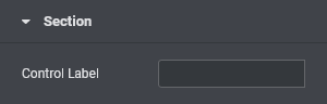
Control label represents the field caption in the editor. It's a string that helps user to understand what the control represents. It also aids people who use screen readers or other assistive technologies.
$this->add_control(
	'unique-control-name',
	[
		'type' => \Elementor\Controls_Manager::TEXT,
		'label' => esc_html__( 'Control Label', 'textdomain' ),
	]
);
2
3
4
5
6
7
# Label Block
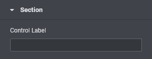
Control labels and input fields are placed side-by-side in the same row. Developers can choose to style controls differently, and stack them one on top of the other instead of the side-by-side.
$this->add_control(
	'unique-control-name',
	[
		'type' => \Elementor\Controls_Manager::TEXT,
		'label' => esc_html__( 'Control Label', 'textdomain' ),
		'label_block' => true,
	]
);
2
3
4
5
6
7
8
# Show Label
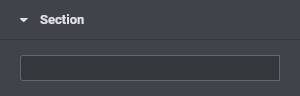
By default all control labels are displayed in the editor. Developers can choose to hide label, leaving only the input field. Please note, for accessibility reasons, the label is not removed, it's only visually hidden.
$this->add_control(
	'unique-control-name',
	[
		'type' => \Elementor\Controls_Manager::TEXT,
		'label' => esc_html__( 'Control Label', 'textdomain' ),
		'show_label' => false,
	]
);
2
3
4
5
6
7
8
# Description
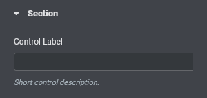
Control description is a simple text that appears below the field, providing the user more information about the control. The description displayed on a seperate row, whether the label and the field are displayed in the same row, or stacked one on top of the other.
$this->add_control(
	'unique-control-name',
	[
		'type' => \Elementor\Controls_Manager::TEXT,
		'label' => esc_html__( 'Control Label', 'textdomain' ),
		'description' => esc_html__( 'Short control description.', 'textdomain' ),
	]
);
2
3
4
5
6
7
8
# Separator
Set the position of the control separator. Available values are:
defaultwill position the separator depending on the control type.before/afterwill position the separator before/after the control.nonewill hide the separator.
This argument is usefull when seperating between two more controls.