The Road to Additional Custom Breakpoints

Cover image

At Elementor, we pride ourselves on listening to user requests. In fact, roughly 80% of all features have been developed based on such requests. Additional custom breakpoints have been at the top of the list for quite some time.

We are determined to  ship this feature, but we want to do it right. This post shares some of the constraints that we are currently dealing with to make Additional Custom Breakpoints ready.

Before we delve into the challenges, we want you to know that Additional Custom Breakpoints are coming! We are continuing our efforts towards a robust and reliable Additional Custom Breakpoints solution, and plan to ship it as soon as it’s ready.

Challenge #1: Finding a Solution That Doesn’t Jeopardize the Code

Elementor was originally built around two breakpoints only. In order to offer additional breakpoints, we need to make fundamental changes in a wide range of places in the codebase.

The breakpoints system has many touchpoints in Elementor’s most sensitive core classes and methods. Any change being made in the plugin’s core infrastructure has to be done extremely carefully, in order to make sure we do not break any existing sites.

Today, when add_responsive_control() is called, behind the scenes Elementor creates three separate controls with three separate IDs: control_id, control_id_mobile, and control_id_tablet. Settings with these three keys are saved to the database. Then, whenever Elementor is loaded (including in the Front End), for each “responsive control”, three controls are being registered and loaded.

Challenge #2: Finding a Solution That Doesn’t Jeopardize Performance 

The “easiest” way to offer Additional Custom Breakpoints without breaking any existing sites is by adding more ‘device controls’ to our existing control-duplication mechanism. This approach is commonly used by 3rd party plugins, and is actually extremely inefficient and can harm performance significantly.

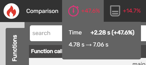
Benchmarking tests performed using Blackfire Profiler showed that using the existing system of control duplication to add three more breakpoints can slow page load times (Frontend) by up to 47% and increase peak memory usage by up to 15%. 

As part of the process that will enable Additional Custom Breakpoints, we are overhauling the entire controls system and how it handles responsive values. The duplicated controls system will be gradually phased out, and will be replaced with a significantly faster, more efficient system. This change will improve overall performance, even for sites that do not add any Additional Custom Breakpoints beyond the existing ‘Mobile’ and ‘Tablet’ breakpoints.

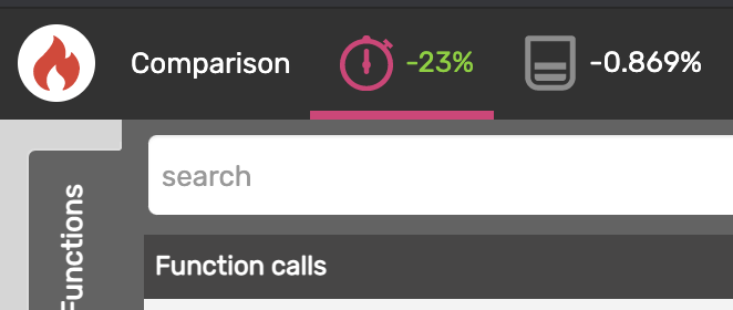
Here are the performance results once loading the same page with only one control (just desktop).

We want to achieve this performance upgrade:

The Expected Solution

At Elementor, we have been working on a solution that will allow for more breakpoints, without jeopardizing the aforementioned challenges.

The development of this feature is taking longer than expected, since we are looking for:

  1. A dynamic solution, one which will make Additional Custom Breakpoints an optional feature for users.
  2. A solution which doesn’t have a negative impact on performance.
  3. A solution which is backwards-compatible (doesn’t cause issues with existing sites).

The Roadmap Towards Additional Custom Breakpoints

In our upcoming releases, we will be gradually including infrastructure and performance improvements relating to the breakpoints system, eventually enabling additional breakpoints.

The roadmap:

  1. Convert hard-coded usage of breakpoints (tablet, mobile, default) to a dynamic system that will utilize registered breakpoints (the two existing ones + future Additional Custom Breakpoints).
  2. Implement UI and UX Improvements for responsive editing and infrastructure for adding, managing, and utilizing new Additional Custom Breakpoints.
  3. Change the way responsive controls are registered, created and utilized, into a more efficient structure.

We hope that by sharing this roadmap, you’ll have a clearer idea of the direction we are taking towards enabling additional breakpoints.

I’d like to add an important sidenote: Custom Breakpoints is a feature that has been in ongoing development since the early days of Elementor. In 2018, we released Custom Breakpoints, giving users the ability to customize the default values of the custom breakpoints in the Elementor Editor. Later on, we changed the responsive layout, making it vertically extendable, which allows for more responsive options. Now, the challenge is to develop the capability to add additional breakpoints in a way that will be optimal for all Elementor users.

What to Expect In the Near Future

It’s clear from the roadmap laid out above that there is a lot to expect for Custom Breakpoints in our upcoming releases. Additional Custom Breakpoints may take a bit longer than expected, since first and foremost, we are committed to ensuring that every feature we release provides our users with a fast, reliable and performant editor. We do not want to compromise quality for speed in our development process. 

Thank you for your patience and trust in Elementor. If you have any questions, please share them in the comments below.

Author

Ariel Klikstein
Ariel Klikstein
CTO & Co-Founder of Elementor. Junkie of music, wakes up in the middle of the night with a good product idea often and dreams about a better world.

27 Responses

  1. This is great communication! Thanks for sharing and good luck with the efforts!

    While you are overhauling the system, from a user standpoint it would be great if you unlink the padding and margin in reponsive mode it would show the numbers of the ‘higher breakpoint’ settings instead of defaulting to 0.

    (So desktop padding = 20 30 20 30. Go to tablet it shows nothing. Unlink defaults to zero but should maintain the current settings).

    Also highly desired responsive controls:

    – responsive control background colors
    – responsive control font colors + width
    – responsive control shadow on/off

    Good luck out there!

    1. Agreed! If we have more breakpoints this could end up a lot more confusing than it is now. I’d love to see these fields inherit. Often I want top or bottom padding to stay the same but adjust right and left. Currently I have to click back and forth between the views and memorize what I wrote. A button called inherit could solve this.

    2. That’s an important point. There should be clues as to what are the inherited values and from where are inherited

      And the other three points are good ones too. Basically the more stuff having responsive options, the easier for us.

  2. I understand the breadth of this functionality and also understand that it is not enough to just ask a developer to take care of it if improvements have not been made in the infrastructure beforehand, I am aware that these improvements take time and thought and are not done in a snap. So take the time you need to provide us with something that is up to the task ;). Simply, I know that an import/export function is under development and is not coming in 3.1, how come? I wanted to know what was planned for the Pro version?

  3. “A solution which is backwards-compatible” <— I think this is what is really holding most Elementor progress back! 3.0 was a huge overhaul, and would have been the perfect opportunity to implement this complex feature… or any other major code revisions!
    "Reducing code bloat" is the other major issue I hear a lot, but also is delicate due to older sites.

    I say, stop worrying about backwards compatibility. If you can't find an upgrading solution that can translate older sites into the new format, then release an entirely new Elementor version and offer minimum patches for legacy versions. The new Elementor Cloud may be your next chance to create a cleaner, leaner, meaner offshoot of Elementor!

  4. @Ariel do you have an idea when this finally will happen?
    This feature request is already 3.5 years old and for long time you haven’t listened to your customers.
    The milestone says version 3.1. Can you confirm that will happen in the next couple of weeks?

  5. From the developer’s perspective I can understand how difficult it can be to implement something that seems too “easy” for ordinary users, but much more complex under the hood.

    Thanks for sharing and hope too see this feature will go live one day.

  6. I am really dying for a simple viewport width (& height) slider

    The default breakpoints are very well selected and i believe they could cover almost all cases when designing responsively, IF we could just have the option to check the situation in the intermediate viewports by just draging the edges of the viewport ……. (like in the responsive preview mode of the inspector tool in browsers)

    Having the option to add additional breakpoints is certainly a powerful feature but i believe the function of simply dragging the edges of the viewport (and with a pixels ruler ofcourse) to just only check (without necessarily using / inserting a breakpoint) the design in various viewports is more urgent and important

  7. Along similar lines:

    Does anyone know: is there a way to fetch the Elementor breakpoints as a CSS variable? If not by default, then could they be dynamically created using JS?

    It would be nice to be able to write CSS which has dynamic breakpoints (ie: variables vs. fixed values).

    Thanks for any insights!

    1. Currently, they are just fixed values. I agree that CSS variables would be nice—a more dynamic approach. I would think this should be relatively simple to add a future version.

      For example, the variable syntax would be:

      @media (max-width: var(–e-global-breakpoint-mobile) ) {
      // your mobile CSS here
      }

  8. Hi

    Thanks for the update. Really helpful and refreshing to get an insight into your thinking and journey with this development. One thing I wanted to add in terms of desirable settings would be the ability to change the rotate angle of a widget at the different breakpoints – both currently at the set breakpoints and also in the future at custom breakpoints. This would really enable us to bring in the wow factor with designs that used angled text/objects at desktop widths and then flattening out for tablet and mobile. It could be transformative in terms of design options.

  9. This cannot come quick enough! I’ve tried so many plugins to workaround this and had no luck.

    Really hope we can get this soon!

  10. Is there an estimated timeframe such as 6 months, 1 year, 2 years…for the first additional breakpoint?

  11. Sometimes in CSS I used the data-elementor-device-mode custom attribute instead of media queries, will that still be possible?

  12. I guess I’m a bit late to the party here altough “responsivness” has been always one of those pain points for me when it comes to working with Elementor.

    Not sure if it has been already pointed out but I think there is a difference between “styling” for additional breakpoints and just “testing” it. In my point of view (with 12+ years experience in web development) it makes not much sense to have 20 additional breakpoints styling each of them individually. However, I feel there is the need of at least 1 additional breakpoint for styling.

    But the issue goes even a little bit deeper, since the overall approach in Elementor is still non-mobile-first altough all numbers around the world speaks volumes. I sincerly believe that it can be really difficult to switch to the mobile-first approach since Elementor gets used by hundrets of thousands of users already. However, I strongly believe there is no way around to start properly tackle this issue.

    From user/admin experience I wouldn’t expect much change. User/Admin can still work as they’re used to. The difference will just be that specific values set for a larger breakpoint will NOT inherit to the smaller ones as this happens now. For example: When you set some padding on a section/column/element on the “desktop” view it will automatically inherit this to the “tablet” and the “mobile” views. This shouldn’t be the case. Instead it needs to work completely opposite. You set some padding for the mobile and it will be inherited for for tablet and desktop and THEN the user/admin can adjust this as they need to.

    On top there should be at least one more larger breakpoint for larger screens. It does not matter what it will be called but the breakpoints should be like 640, 1024, 1200 and one for everything above 1200. Something like that.

    Last but not least I think it should be differentiated between those breakpoints to actually work with and style for and the testing tool in the editor (on the bottom of the sidebar). There should be an option to simply add additional breakpoints to this just for testing purposes. Or even better – no way to edit this, but when the editor sidebar is getting collapsed a small tool will be visible to choose any resolution to test for, even with portrait and landscape mode – and THIS can be easily customized.

  13. We really Need the custom breakpoint to work with Bootstrap 5 framework. Please add that feature as soon as possible to work smoothly with bootstrap framework.

  14. I came across something that with another builder that I believe may be a better solution than adding additional break points. Instead of adding more custom breakpoints, have you considered using a calc( ) function to size all elements, their padding and margin? In the builder, we could then just enter a maximum and minimum value for an element size, padding or margin, that would be calculated based on the viewport width of the device being used. I understand I can do this by setting up custom classes and CSS, but it would be amazing addition to builder.

Leave a Reply

Your email address will not be published. Required fields are marked *