The beta of Editor version 4 is now available in Elementor 3.35 and has been officially marked ready for production use. The completion of the alpha phase is a significant milestone, confirming that version 4 is now stable and no longer experimental. We are rapidly approaching the official transition of the Editor to version 4.0, which will automatically activate its features on new sites and establish it as the default editing experience in Elementor.
Version 4 Architecture: Ready for Production
Version 4 introduces a completely new architectural foundation, specifically designed to clearly separate structure, styling, and content. This separation is key to enabling more predictable layouts and safer reuse of elements.
While the overall editor experience will feel familiar, the underlying systems have been extensively updated to support larger, more complex site builds.
Version 4 Beta is considered production-ready for real projects, meaning core editing workflows are stable and suitable for live sites. The output is predictable and maintains compatibility with all existing Elementor sites.
This is the final major step before the official 4.0 release and the automatic activation of atomic features on new sites. Important to note that existing sites and features aren’t going anywhere. New features will continue to live alongside existing ones and you’ll be able to use version 4 and version 3 together.
Components: Build Once, Reuse Everywhere
Components are a primary building block of version 4, representing a major advancement toward a truly scalable, production-ready editing environment. They are designed to let you create reusable layout sections that remain fully synchronized across your site while supporting controlled per-instance content customization. Components are built with the needs of real projects, complex workflows, and professional teams in mind.
You can create reusable layout blocks with full site synchronization by converting any Flexbox or DIV Block into a Component and giving it a clear identity. Components are then easily accessible in a dedicated tab and can be added to the canvas just like any native element.
When a Component’s layout or structure is edited, all instances update automatically across the site, making them ideal for shared, consistent sections such as headers, feature grids, call-to-action banners, and other repeated patterns.
Components also support properties for content, giving you the ability to expose specific parts of a Component’s content for per-instance editing.
As the site admin, you determine which content properties—including text input, media, links, and HTML tags—can be customized. This ensures that editors can adjust only the exposed properties, keeping the layout and structure protected and globally synchronized.
This balance of flexibility and consistency makes Components particularly powerful for professional workflows, team collaboration, and client handoff. As a core capability of version 4, they provide layout-level reuse instead of the previous widget-level globals, enforce a clear separation between structure and content, and offer central management for scalable site building. Together with Variables, Classes, and the new styling architecture, Components introduce a more systematic method for building and maintaining sites as projects grow in complexity.
Inline Editing for Atomic Elements
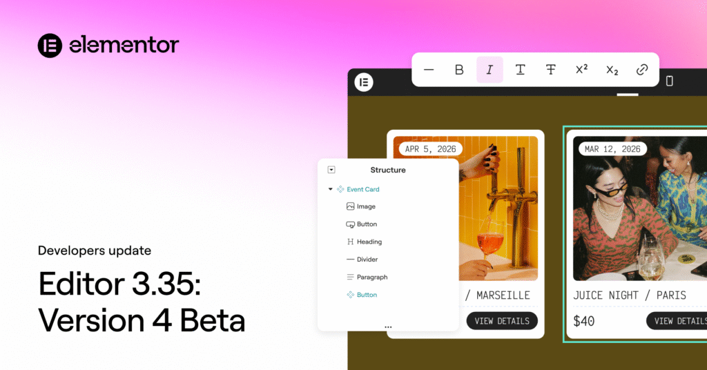
We are introducing Inline Editing for Atomic Heading and Paragraph Elements, a feature that significantly improves the editing workflow in version 4 by allowing you to edit text directly on the canvas without having to shift focus to the panel.
When an Atomic (version 4) Heading or Paragraph Element is clicked, the text becomes editable directly on the canvas. Changes are applied instantly and remain fully synchronized with the panel inputs, which makes quick copy updates, layout reviews, and content refinements faster and more intuitive, particularly when working across multiple sections or pages.
Contextual formatting controls appear as a floating toolbar near the selected text, providing quick access to common inline actions directly on the canvas. The toolbar supports Clear formatting, Bold, Italic, Underline, Strikethrough, Superscript and Subscript, and Links. The toolbar is contextual, appearing only when text is selected, staying within the viewport, and supporting keyboard shortcuts for accelerated editing. All formatting is applied visually, without exposing raw HTML or requiring code-level interaction.
A Unified Elementor Menu in the WordPress Admin
In version 3.34.2, a refreshed Elementor menu was introduced into the WordPress Admin, designed to make site management clearer, more consistent, and easier to navigate under a single, unified Elementor entry.
At the top of the menu, you will now find a new Elementor homescreen, which acts as a central dashboard with shortcuts to common actions and provides a clearer overview of your Elementor setup.
All editor-related settings and tools are now logically grouped under a new Editor submenu, containing all the familiar menu functionalities.
Templates are now part of this new Editor menu, and Custom Fonts, Custom Icons, and Custom Code have been consolidated and grouped as “Custom Elements.”
Furthermore, System Info, Element Manager, and Licence/Connect are now grouped together under “System” inside the Editor menu. You can find more details on these navigation changes here.
Dynamic tags in color controls
Dynamic tags are now supported in color-related controls, including text color, background color, border color, box shadow color, and drop shadow color. This allows colors to be driven dynamically by retrieving them from ACF or WordPress native custom fields.
Improved HTML semantics for links and actions
To further improve accessibility, keyboard navigation, and screen reader behavior, link behavior has been refined to better reflect semantic roles. Elements that trigger actions now use the appropriate tag, while navigation continues to use tags.
To Conclude
The release of Elementor 3.35, featuring the production-ready version 4 Beta, marks a critical inflection point in the Editor’s evolution. With its new architecture—specifically designed for clear separation of structure, styling, and content—developers can rely on a more stable, scalable, and predictable foundation for complex builds.
The introduction of Components serves as the cornerstone of this new system, enabling layout-level reuse with global synchronization and fine-grained control over instance-specific content, a significant step up from previous global widgets.
Complementary features, such as Inline Editing for Atomic Elements, directly streamline the day-to-day editing experience, while the unified Elementor menu in the WordPress Admin simplifies site management and navigation.
Together with the addition of dynamic tags in color controls and refinements to HTML semantics for improved accessibility, this update firmly establishes Elementor on the final stretch toward the official 4.0 release and a more systematic future for site building.
We encourage all developers to begin integrating the version 4 Beta into their production workflows to prepare for its automatic activation as the default editing experience.
