Hi Elementor beta testers,
We are incredibly excited to introduce our new beta versions, Elementor 3.14. Elementor Pro includes a new Carousel widget, which will enable you to nest elements within each slide in the carousel for unlimited design creativity. With this version, you can also incorporate strategic ad placements in your Loop Grid to grab your visitors attention, in addition to a multitude of additional design capabilities so you can make beautiful websites that stand out.
Try out our new beta versions and let us know what you think about our newest additions, which include:
- [Pro] New Carousel Widget for Nesting Elements
- [Pro] Loop Grid – Static Item Position
- [Pro] Important – Loop Carousel HTML Changes in Pagination and Navigation
- Global Styles Preview
- And more…
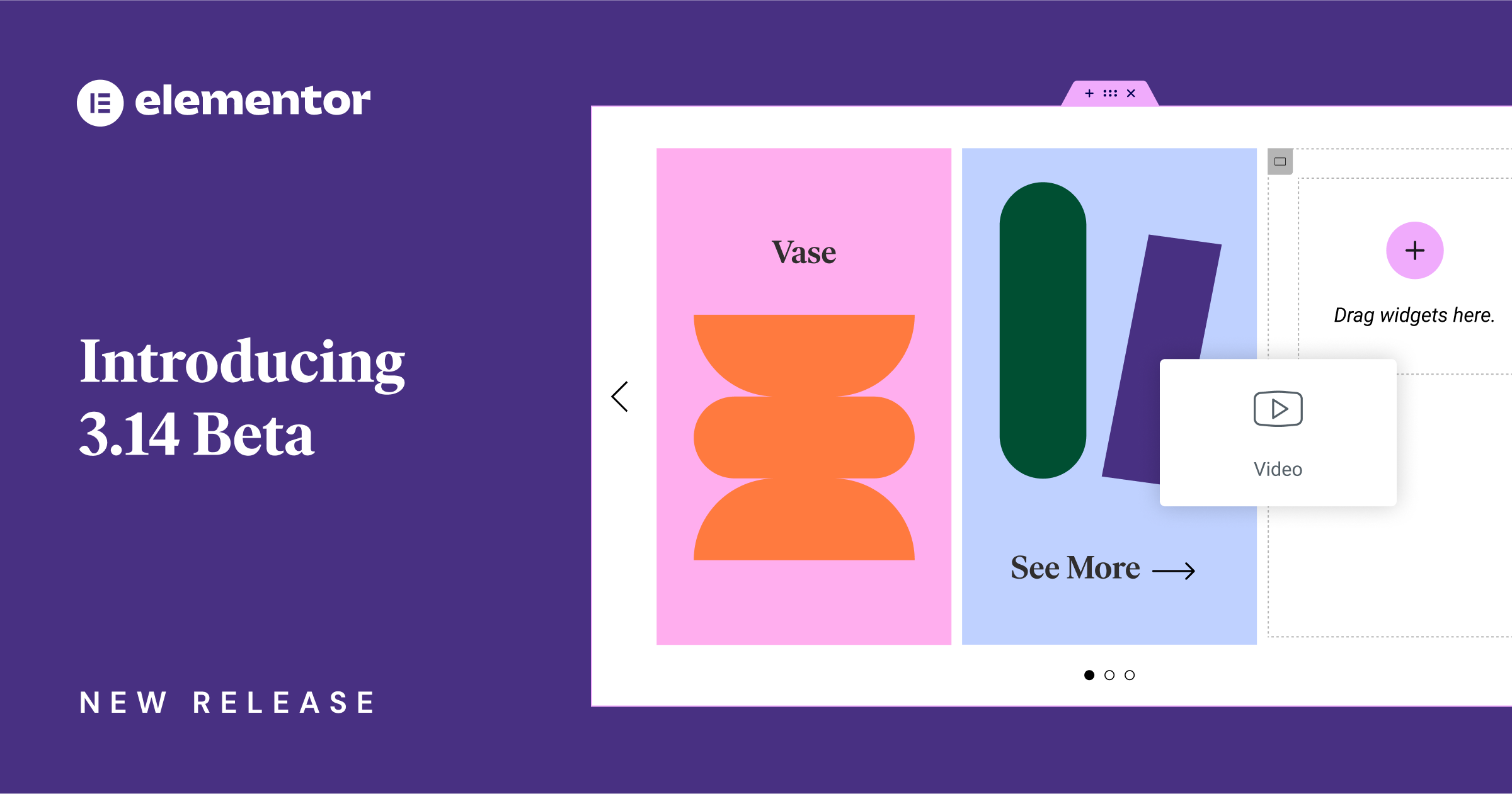
[Pro] Introducing – New Nested Carousel for Infinite Design Possibilities
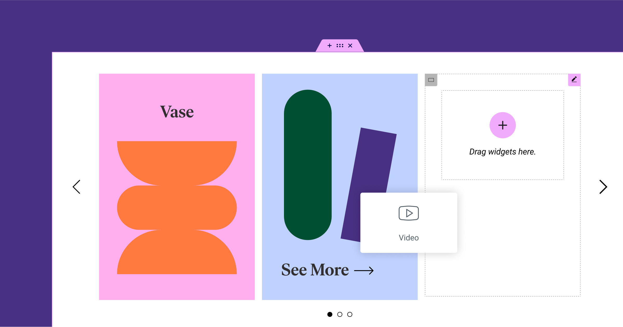
This version includes a new Carousel widget, which is nestable. To use the new widget, you will need to activate the Container, and Nested Elements features by going to WordPress Dashboard → Elementor → Settings.
Up until now, Elementor included a number of Carousels – Image Carousel, Media Carousel (Pro), Testimonial Carousel (Pro), and Reviews (Pro). Each of these Carousels came with a predefined layout, and you couldn’t adjust their layout, or add new elements like text or image that weren’t already part of the widget.
The new Carousel Widget is nestable, which provides you with unlimited flexibility. Each slide in the Carousel is a Container, allowing you to add any element you’d like to and adjust its layout to your heart’s content. Additionally, the Style and Advanced tab in the new Carousel widget include all the capabilities available in the other Carousel Widgets.
To make it easier to drag elements into each slide, we disabled the Autoplay and Infinite Loop features in the Editor. These features are still accessible, as usual, and you’ll be able to see them in action in the preview.
Pro Tip: Try creating highly engaging designs by adding background images to create 3D-like effects.
How to Test It:
- Ensure you activate the “Flexbox Container” and “Nested Elements” features by going to the Elementor menu in WordPress → Settings → Features.
- Create a new page and drag the Carousel widget into the Editor.
- Adjust the layout by adding more Carousel Items and changing the Slides to display, Slides to scroll and Equal Height options.
- Add widgets to the slides and create a layout that fits your design.
- Continue exploring the carousel settings, navigation and pagination options.
- Go to the Style tab, adjust the spacing between slides, and style the navigation and pagination with the dedicated style controls.
- Make sure everything works as expected in the Editor and on the Frontend.
[Pro] Static Item Position in the Loop Grid – Display Ads and Other Static Content
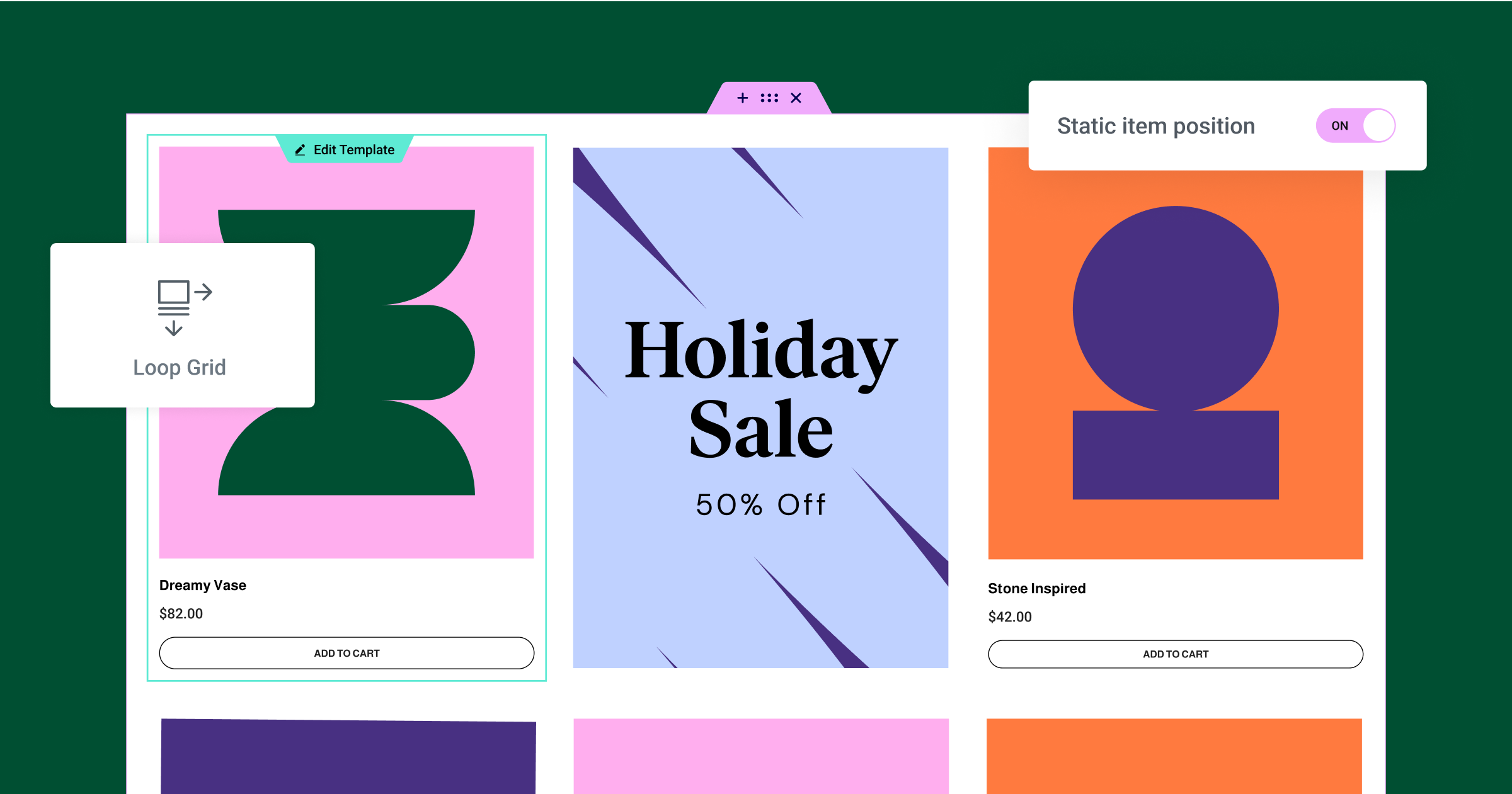
Injecting a different template, with static content into your Loop Grid is an excellent way to promote a certain product, event, or other piece of content that you want to have stand out from the rest of your Loop Grid. This update includes the new Static Item Position feature, as part of the Loop Grid, to enable you to inject a static item in between the posts or products in your Loop Grid.
Now, when you apply an alternate template, you will have a new toggle that enables you to add a Static Item Position. When you enable it, and you choose a template (or create a new one), it will display a static item in the position of your choice within the grid.
For example, you can apply an alternate template to promote an event, a certain product, and more and inject the template in the second position of your Loop Grid. In this case, the static item will take the place of the second Post or Product in the Grid, and the second Post or Product will be bumped into third place.
To use the Loop Builder features, you will need to ensure you have the Loop Feature enabled on your website. You can enable it from the WordPress Dashboard → Elementor → Features.
How to Test It:
- Ensure you have at least six posts or products on your website.
- Create a new page, edit it with Elementor and drag the Loop Grid widget into the Editor.
- Design a main Loop Item template (or choose an existing one) under the “Choose a template” control in the widget panel.
- Activate the “Apply an alternate template” option, and choose an existing template or create a new one in the Theme Builder.
- Choose the position you want to place the Static Item in using the “Position in grid” field.
- Enable the “Static item position” option.
- Ensure the alternate template doesn’t replace the post in the designated position, but rather the new template and content is added between the posts, based on the grid position you indicated.
- Change the Column Span option to adjust the layout of the alternate template.
- Check how pagination is affected by the Static Item Position being enabled.
- Make sure everything works as expected in the Editor and on the Frontend.
[Pro] Important – Loop Carousel – HTML Changes in Pagination and Navigation
Elementor 3.14 introduces potentially breaking changes to Loop Carousel. The HTML behind the navigation and pagination of this widget (the dots / fraction options and arrows) have been updated. This enables Elementor to fix the position of the navigation and pagination indication when using Containers. Additionally, these changes will facilitate new styling features in the future.
If you applied Custom CSS to these areas, we recommend that you check your website and ensure that the HTML changes did not change your Loop Carousel’s display, and make necessary adjustments if it did. We apologize for any inconvenience this may cause.
Introducing the Global Styles Preview
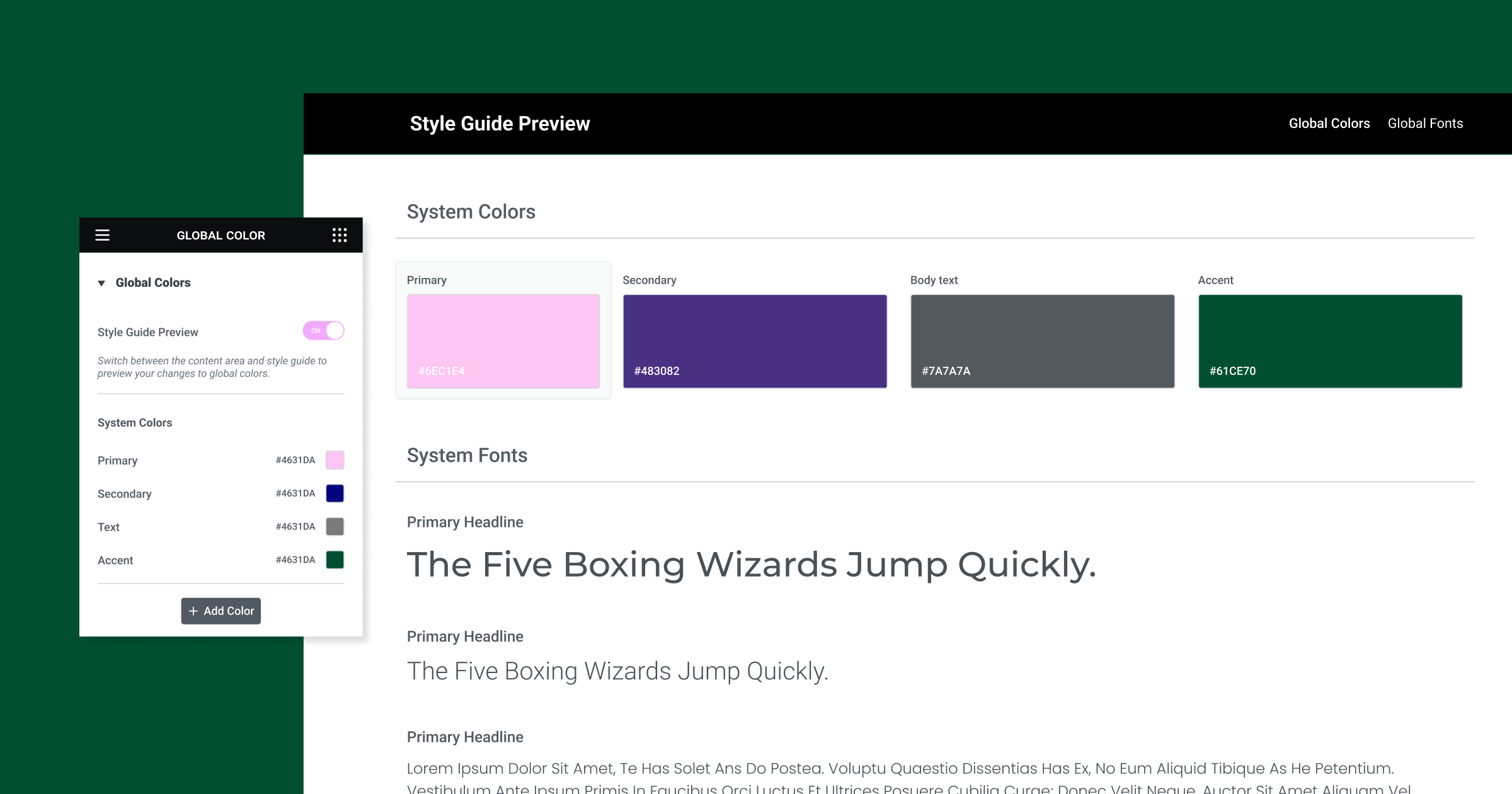
Global styles are the foundation of your website’s design system, and enable you to ensure you are using the same colors and fonts throughout your website. To provide you with better insight into your website’s global colors and fonts, you can enable the new Global Styles Preview, available in your Site Setting’s Global Colors and Global Fonts. This will be available as an experiment that is active by default on Elementor Hosted website, but needs to be enabled manually for Plugin websites.
Enabling this preview will cover your entire page with the Style Guide Preview, which will showcase your global colors, and fonts, showing you what your global styles actually look like on a web page. Any changes you make to your global styles will automatically update your preview, so you can see the impact of your changes, instantly. Additionally, any time you click a color or font in the Global Preview, it will open the Color Picker or Font Picker respectively, so you can make changes seamlessly.
How to Test It:
- Ensure you activate the “Global Style Guide” feature by going to the Elementor menu in WordPress → Elementor → Settings → Features, and save.
- Create a new page and start building your design.
- Go to the Site Settings panel using the keyboard shortcut Ctrl/Cmd+k.
- Open the Global Colors section and ensure the Style Guide Preview is enabled by default.
- Check the preview screen and ensure the system and custom colors are presented correctly.
- Adjust the color of existing global colors or create new ones.
- Ensure the colors are added or changed on the preview.
- Try to delete or duplicate the color and ensure it’s working as expected.
- Click on one of the colors in the preview, and ensure the color picker modal opens on the correct color on the Global Colors panel.
- Check the above steps with the Global Fonts section.
- Disable the Style Guide Preview option and ensure you switched to the content area.
Make sure everything works as expected in the Global Colors/Fonts panel and in the Preview.
Elementor UI and UX Improvements
Elementor 3.14 includes a variety of usability and interface updates that will streamline, improve, and accelerate your workflow – so you can spend more time designing your website.
Add Widgets to the Editor with a Click
Up until now, if you wanted to add a widget to the Editor, you would need to drag it in. Sometimes, it became difficult to drag it into the specific Container or Column you wanted it to be in. With this update, clicking any widget in the widget panel will automatically add it to the latest Container you were focused on. If the last area you focused on in the Editor was another widget, it will place the new widget beneath the one you previously focused on.
Please Note: If you’re still using Sections and Columns, you can only add one inner section in each column. Clicking the Inner Section widget again will not add a second inner section inside a column, and will not provide a visual indication of this being an impossible action, which would have been visually indicated if you tried dragging it in.
Visual Indication of Page Parts
When working on pages that include theme parts such as a header, footer, loop item, and more, it would sometimes be difficult to transition between the page body and the other theme parts, as you would have to click directly on the handle to switch between them.
With this update, if you’re working on the page body, and want to edit the Header for example, hovering with your mouse over the header will add a semi-transparent overlay that when clicked, anywhere within the area – not only on the handle, will direct you to edit the header. Similarly, when editing a theme part like the header and hovering over the page body, a semi-transparent overlay will appear that when clicked will direct you to edit the page body.
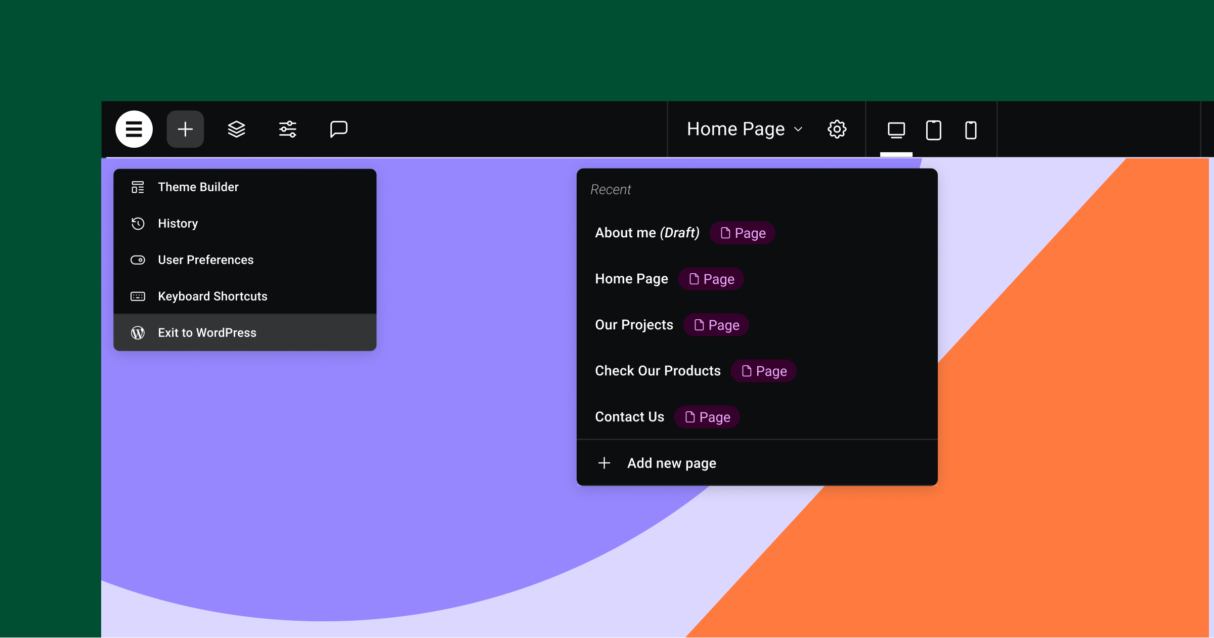
Top Bar Enhancements
The Top Bar, a new feature first introduced in Elementor 3.12, was created in REACT to improve scalability of introducing new features in the future. The Top Bar also centralizes many of the actions you perform in Elementor, in one single area to promote best practices when using Elementor. In this version, Elementor introduces three new capabilities to the Top Bar, available as an Experiment that you can enable by going to: WordPress Dashboard → Elementor → Features → Editor Top Bar.
- Add a new Page – when you click the Page Indication area in the middle of the Top Bar, you can now also add a new page without having to switch back and forth between the Editor and the WordPress Dashboard.
- In Place Editing for Website Parts – when you create a new page from the Top Bar, it won’t reload the entire Editor, but rather just the canvas itself, enabling you to edit the next website part, in-place to reduce the loading time and let you get to work quicker.
- “Manage Website” Renamed “Exit to WordPress” – following your requests, we’ve replaced Manage Website with Exit to WordPress, which will take you to the back end of the website part you were working on.
WordPress and WooCommerce Functions Now Available Also in Elementor
To reduce your need to switch back between Elementor and WordPress and streamline your workflow, we’ve added a number of capabilities available in the WordPress Page Settings to the Elementor Page Settings, including: order (for hierarchical post types), and the ability to allow comments to a page / post. Additionally, if you have a WooCommerce website, you can also set your shop page by going to the WooCommerce Settings panel within Elementor’s Site Settings.
New Keyboard Shortcuts
Elementor 3.14 introduces a number of changes to the keyboard shortcut panel, available by clicking CMD / CTRL + ?.
- Added the shortcut to Notes
SHIFT+C, which was missing from the keyboard shortcuts panel.
Added two new keyboard shortcuts:
CMD/CTRL+SHIFT+Uto open the “User Preferences” panel.CMD/CTRL+SHIFT+Yto open the “Page Settings” panel.
More Styling Options in Various Widgets
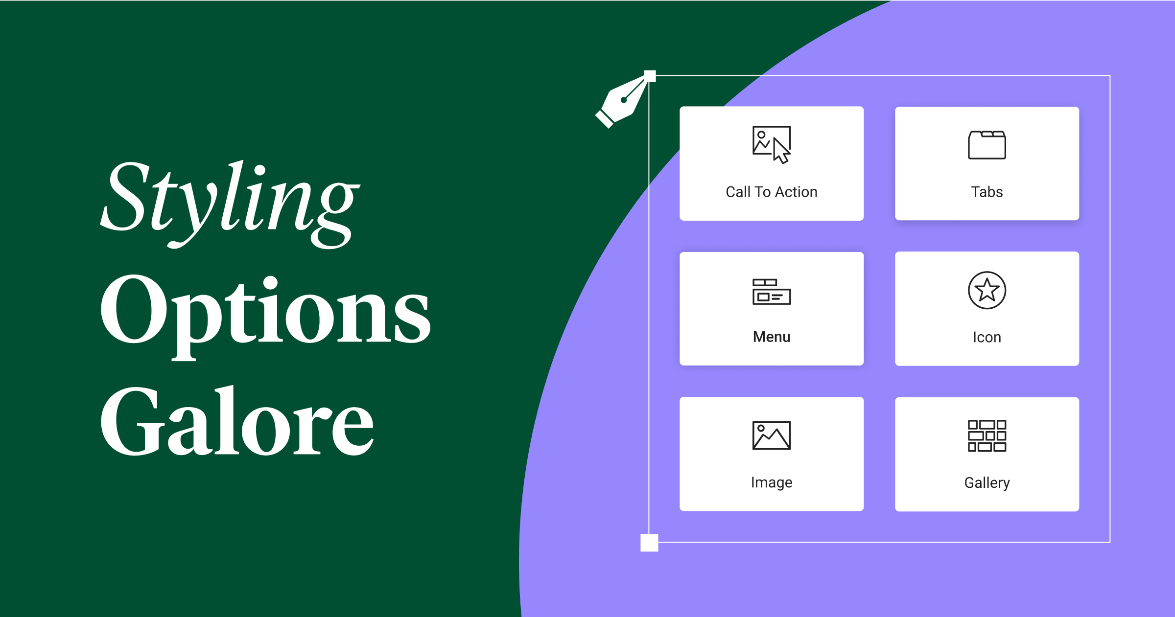
Tabs Widget – this update includes two new capabilities in the Additional Options section (formerly Responsive Settings) in the Content tab of the Editing panel:
- Breakpoint – choosing the new option ‘None’ will maintain the Tabs structure across every breakpoint, instead of switching it for an Accordion at a certain breakpoint This has been a highly requested update for the new Tabs widget.
- Horizontal Scrolling – enabling this will allow all Tabs to be in a single row. Website visitors can scroll through them horizontally if they don’t fit in the viewport. It’s important to note that there is no specific visual indication for users that they can scroll horizontally.
Icon Widget – now, you can choose fit to size in the style tab of the Icon widget to modify the amount of space an uploaded SVG icon takes up. This is especially handy if your icon’s width and height aren’t the same.
[Pro] Menu Widget – with Elementor 3.14, you can add a Divider to the Menu Items in the Menu widget. Dividers are located in the Style tab, enabling you to adjust the divider’s width, height, color, etc. The Divider won’t appear when the Menu is switched for an accordion (in certain breakpoints).
Image Widget – in the style tab, when you adjust the height you are able to choose the object fit – default, fill, cover, or contain. Now, when you choose cover, you can also choose an Object Position to position the image according to your needs.
[Pro] Call To Action Widget – the styling options of the Call to Action button are now matched to the Button widget’s styling options to create a consistent editing experience. Now you can set the button padding, add a box-shadow and a text-shadow, just like you could in the Button widget.
[Pro] Gallery Widget – previously, when you add a link to the media file of images in a gallery, it would open a lightbox or link to the image directly, based on the Lightbox setup in your Site Settings. With this update, you can control the lightbox display for each gallery widget overriding the default site settings lightbox options.
Performance & Accessibility
Button widget – added conditional ROLE Attributes based on whether the user set a link to the button or not.
Accordion & Toggle widgets – updated the widgets to be compliant with W3C recommendations. Now, all warnings you previously would have seen in lighthouse reports have been fixed.
[PRO] Video Playlist widget – changed the loading mechanism of all images to lazy load to improve the page’s initial loading time. Additionally, to improve SEO the missing ALT attributes have been added to the playlist’s cover images.
Make An Impact: Share Feedback Before Features Are Released
We’re always looking to get to know Elementor customers on a deeper level. If you’re interested in meeting with our team and sharing your insights, feedback, and feature requests you’re welcome to sign up for some quality time with us here. Or download Elementor’s Dev Edition. Talk soon!
How to Install the Beta Version
If you still haven’t enabled beta testing in Elementor, please follow these steps:
- Go to Elementor > Tools > Versions
- Enable the beta tester feature
- Go to Dashboard > Updates and update to the latest beta version.
- This will get you set up to test the new Elementor 3.14 Beta.
Notes
As we make changes to our GitHub in an effort to keep it organized, improve the way we deliver information to you, and our ability to review your feedback, please follow the instructions below when reporting bugs, or making feature requests:
- To report a bug related to this beta version – open a new Bug report
- For feature requests – open a new Feature request issue
- For other comments specifically about this beta version – Comment here
Designated time for release: June 19, 2023 (Estimated)
Many thanks for your support and help!
Cheers,
Elementor Team
