Hi Elementor beta testers,
We are incredibly excited to introduce our new beta versions, Elementor 3.12. This update includes the new Menu widget, which will empower you to create the eagerly awaited Mega Menu. It also includes new Loop Builder features and layout, and design capabilities that will take your website’s design to the next level.
Try out our new beta versions and let us know what you think about our newest additions, which include:
- [Pro] Mega Menu
- [Pro] Loop Alternate Template
- [Pro] Loop Template Library
- Elementor Interface Revamp
- [Pro] Custom Icons in the Menu Cart Widget
- Vertical Alignment in Icon List widget
- Expanded Custom Units Everywhere
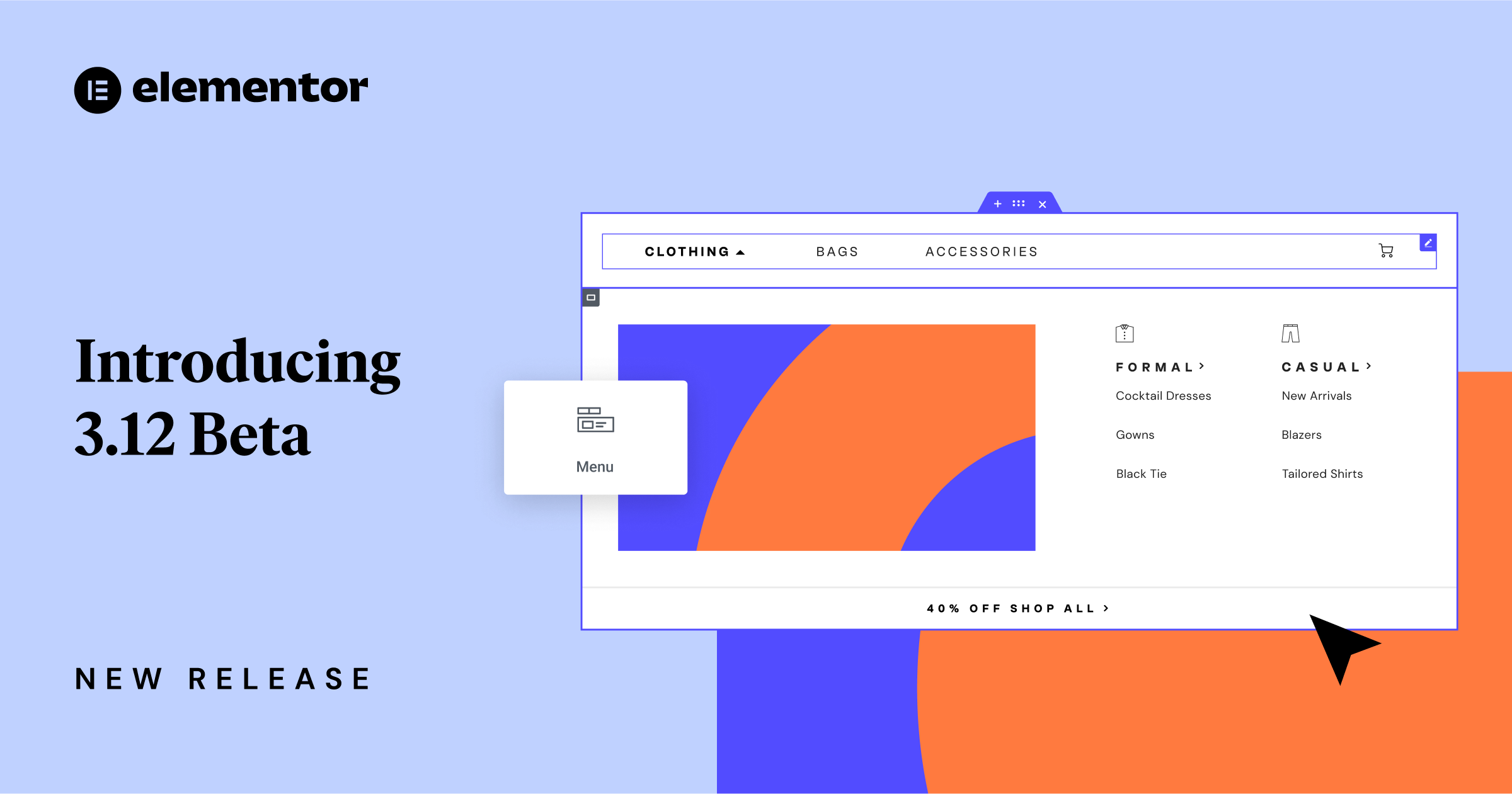
[Pro] Introducing the Mega Menu in Elementor With the New Menu Widget
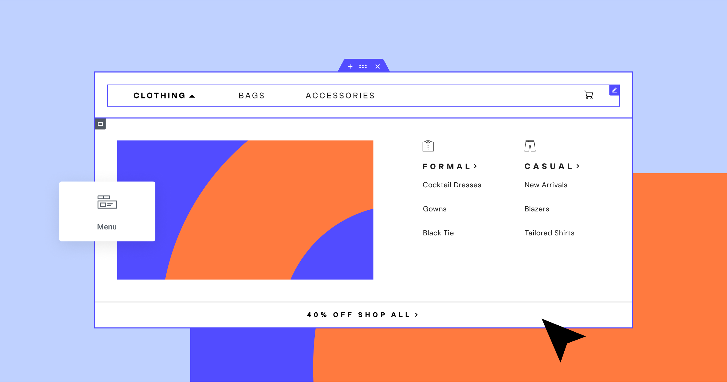
Elementor 3.12 introduces the eagerly awaited Mega Menu. The new Menu widget will empower you to achieve a much higher level of design, customization and creativity than the Nav Menu widget (now renamed WordPress Menu). With the new Menu widget, you will also be able to create a Mega Menu, an expandable menu where you can create any layout you’d like. Within the menu you can use any type of widget, display any type of content, and link to any page. Mega Menus are ideal to improve the visitor experience in websites that have a complex navigation architecture, as well as for displaying beautifully designed menus that stand out.
The new Menu widget is available once you activate the Container, Nested Elements and Menu experiment. With this new widget, you can create a simple menu with no dropdown content or you can enable the dropdown content per item. Enabling the dropdown content will create a Container for the content area of each menu item. Within this container, you can create any layout by placing elements within the container and nesting containers.
Setting up Navigation
While the Nav Menu widget (now renamed to WordPress Menu) automatically created the menu items and linked to the pages based on your Menus screen in WordPress, the Menu widget enables you to create your Menu Items from scratch. You can give each Menu Item a name of your choice, and link it to any page, yourself, giving you more flexibility to structure your website’s navigation. Once you’ve created your menu, you can also determine how visitors interact with and open dropdown menus – upon hover or click, and whether opening a dropdown menu is animated or not.
Styling your Menu
The new Menu widget includes many styling capabilities, which empower you to create the perfect menu for your website. You can set the styling of the main menu using all of the styling capabilities available to you in the widget panel, including the Menu Items, Menu Toggle, Dropdown Menu, and more. In upcoming releases, you will also be able to add icons to your Menu Item’s titles. If you use a dropdown menu, since it is based on Containers you will also be able to use all the styling and settings of Containers to adjust the style of your dropdown content.
Responsive Settings
To provide website visitors with a good experience, you can choose the breakpoint at which the menu becomes a menu toggle. Then, you can customize the icons you use for the menu toggle in its normal, and active states.
How to Test It:
- Ensure you activate the “Flexbox Container”, “Nested Elements” and “Menu” features by going to the Elementor menu in WordPress → Settings → Features.
- Create a new page and drag the Menu widget into the Editor.
- Change the Menu Items by changing the title and adding links if necessary (Tip: Use the Internal URL dynamic tag to add link).
- Inside the Menu Item repeater, activate the Dropdown Content. Click on the menu item in the canvas to edit its dropdown content.
- Drag and Drop widgets inside the dropdown content area and ensure they are presented as expected.
- Adjust the layout by changing the Content Width, Item Layout, and position.
- Choose how the dropdown content will open – upon click or hover.
- Continue exploring the Menu Toggle icon option and Responsive Settings.
- Go over to the Style tab, and style the Menu Items, Menu Toggle, and Content area.
- Make sure everything works as expected in the Editor and on the Frontend.
[Pro] Diversify Your Design with a Loop Alternate Template
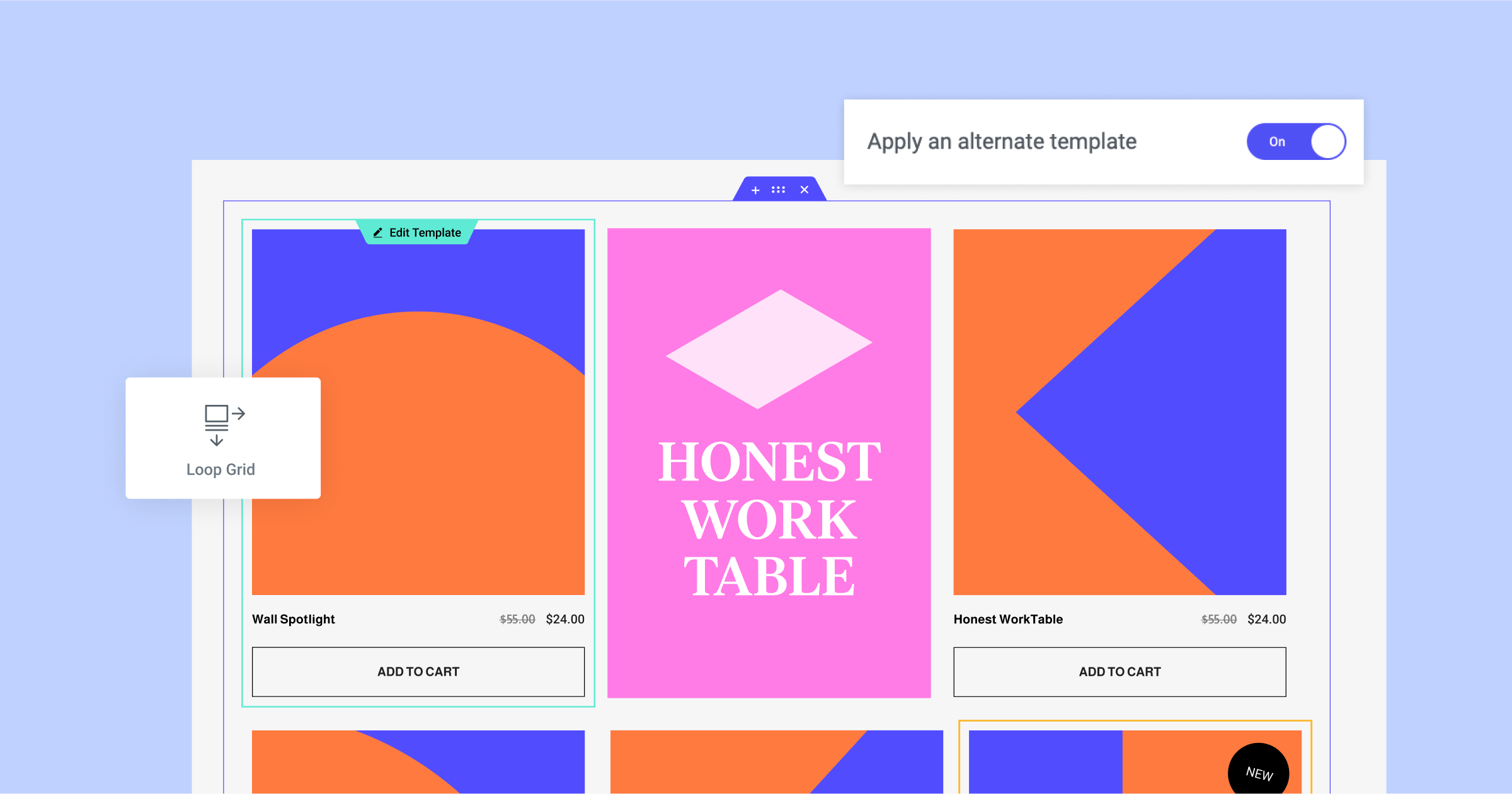
To enhance your website’s design and enable you to diversify the appearance of your items in a loop grid, Elementor 3.12 also includes a new feature in the Loop Grid widget, “Apply an alternate template” which will enable you to create or apply another template within your Loop Grid.
When you switch the toggle on, you will be able to choose a loop template or create a new loop template from the Theme Builder. The template can be created using all of Elementor’s widgets and enables you to apply a completely different design on specific items in your loop.
As part of this version, applying an alternate template will override the design on the item in a specific location in your loop grid, as per your choice. For example, if you set it to the item in the 2nd position, your alternate template will be applied on the post or product that is displayed in the 2nd position in the grid (displaying content from the query you choose for the Loop Grid). You can then choose if you want the alternate template to repeat within the grid. For example, you can apply an alternate template to the item in the 2nd position in your loop grid, and have the alternate template applied on every 2nd item in your grid.
Column Span
As part of the setup of your Loop Grid’s layout you can choose how many columns and items you want to display on the page. However, when you apply an alternate template, you can choose to have the alternate template span across more than one column. For example, if you have a 3 column grid, you can have the alternate template apply across the span of 2 columns. That way, if you set the alternate template to apply on the item in the 2nd position, and you set it to span across 2 columns, the display of your second post will take over 2 columns in the first row.
How to Test It:
- Ensure you have at least six posts or products on your website.
- Create a new page, edit it with Elementor and drag the Loop Grid widget into the Editor.
- Design a main loop item template under the “Choose a template” control in the widget panel.
- Activate the “Apply an alternate template” option, and choose an existing template or create a new one in the theme builder.
- Ensure the alternate template overrides the main loop template design in the designated position.
- Change the Column Span option to adjust the layout of the alternate template.
- Make sure everything works as expected in the Editor and on the Frontend.
[Pro] Kickstart your Workflow with Predesigned Loop Templates
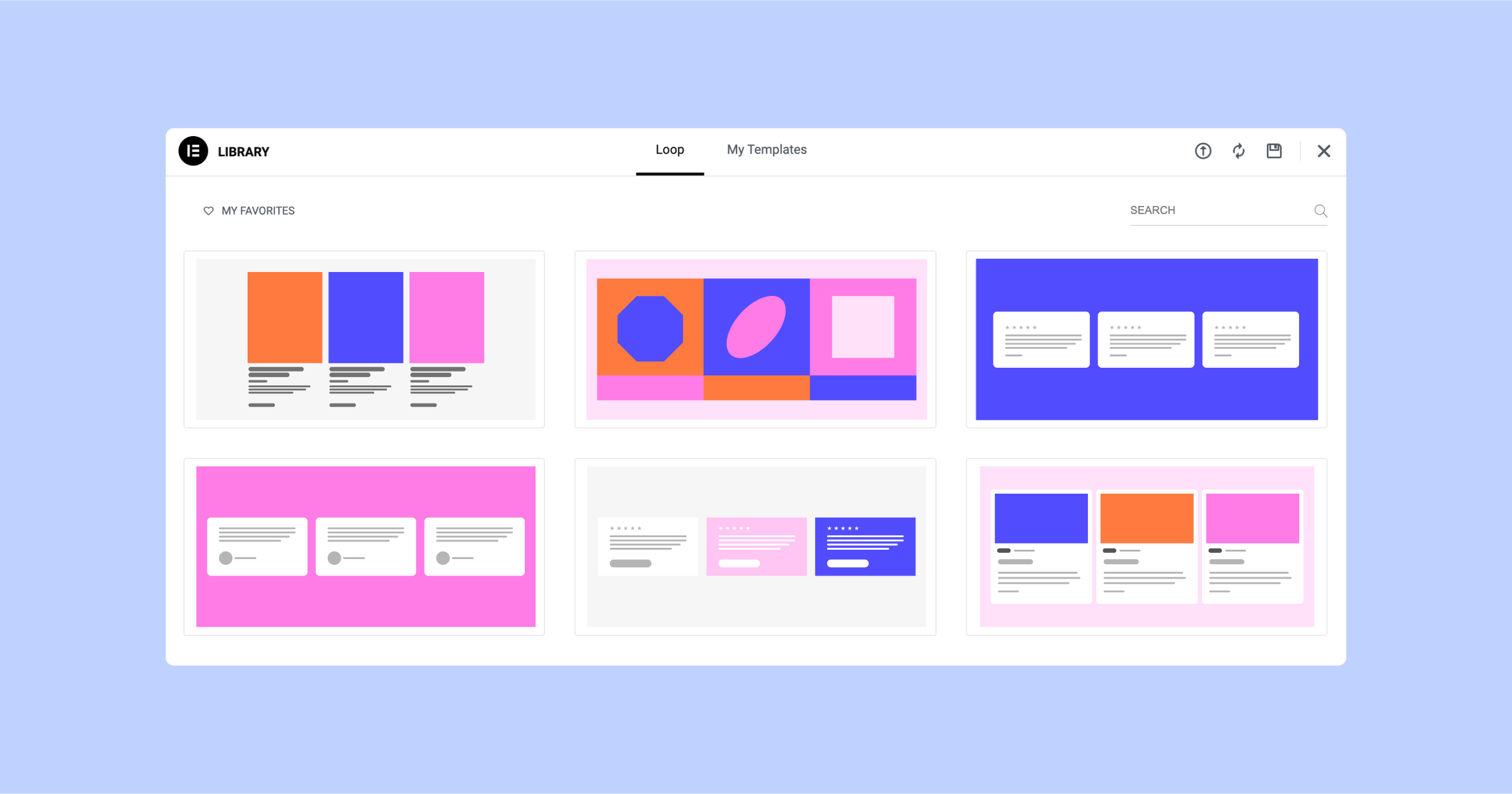
Elementor 3.12 also includes 10 new Loop Templates in the library, 6 for Posts, and 4 for WooCommerce Products, to kickstart your Loop design process. The Loop Templates were designed by Elementor’s library team, following industry best-practice and showcasing the latest trends in website design. You can use any of the Loop Templates in the Loop Grid widget and the Loop Carousel widget, and choose the content and query to match your needs.
Please note: The Loop Templates are container-based and will only be available on websites that have Containers enabled on them.
How to Test It:
- Ensure you activate the “Flexbox Container” experiment by going to the Elementor menu in WordPress → Settings → Features.
- Create a new page and drag the Loop Grid widget into the page.
- Click on “Create a template” button and switch to in-place editing
- Click on the Folder icon and open the loop template library.
- Ensure the templates presented are based on the main source type – Posts or Products.
- Download a loop template and ensure the template is presented as expected.
- Once the main item design is ready, click on the “Save & Back” yellow handle.
- Ensure the other items in the loop are populated automatically based on the main template design.
- Make sure everything works as expected in the Editor and on the Frontend.
Elementor Interface Revamp
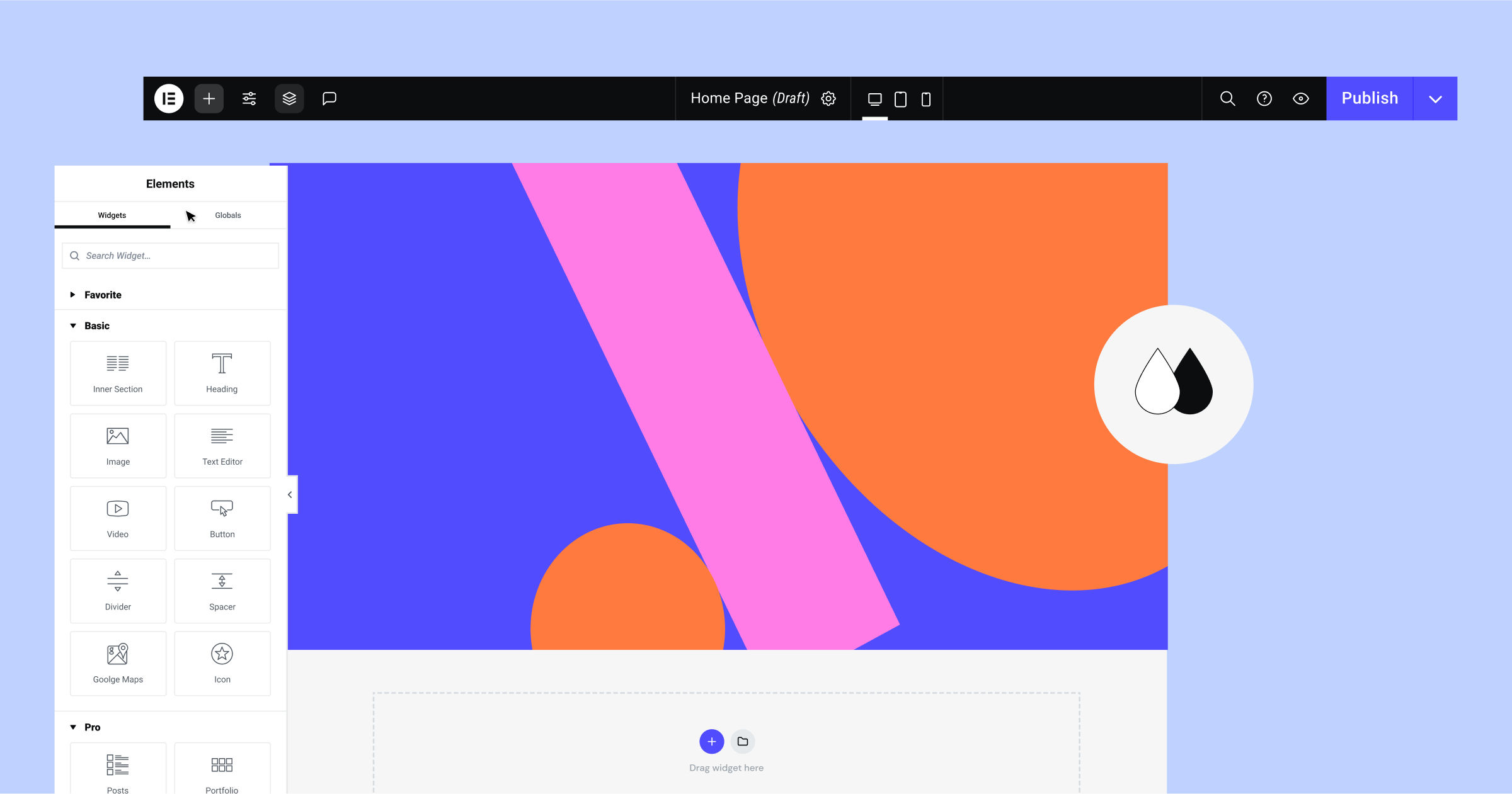
Elementor 3.12 marks Elementor’s 6.5 years of existence, making the Editor’s interface design the same age. Throughout the years, hundreds of new features and widgets have been introduced, and in the world, software User Interface (UI) and User Experience (UX) has changed to cater to new expectations and needs.
In 2023, Elementor’s interface will be revamped gradually, adopting a new design system using better color semantics. The adjustments to the Elementor interface will promote best-practices for website creation using Elementor, will improve its accessibility, accelerate workflow, and enhance your capabilities by introducing new features in the future.
A New color scheme for Elementor
Elementor 3.12 introduces the first change to the Editor’s interface that follows the new color semantics being introduced. As part of this update, the Editor and other Elementor screens have been recolored and simplified. The new colors are better adapted to Dark and Light mode, and are optimized for accessibility. The new color scheme will not impact any functionalities with the product.
Experiment: New Top Bar
Elementor 3.12 introduces a new Top Bar as an experiment, that is turned off by default. This version demonstrates the first phase of the new Top Bar in the Editor, built in React for better performance and to facilitate new capabilities in the future. The Top Bar follows industry best-practices and consolidates all the common actions you need to perform on your website in a central and accessible location.
- In this version, the Top Bar includes the following items and capabilities:
- Elementor Menu, which provides direct access to the Theme Builder, Revision History, User Preferences, Keyboard Shortcuts, and Manage Website (WordPress Dashboard).
- Widget panel – accessible by clicking the “+” icon in the Top Bar.
- Site Settings – direct access to all the site settings.
- Structure – which will open the structure panel (formerly navigator).
- Document indication – which will clarify what website part you are working on at any given time.
- Page Settings – accessible from the cogwheel, which will enable you to adjust the settings of the page you’re currently working on.
- Responsive – the active breakpoints on your website will be placed in the Top Bar and provide you direct access to each of them, improving your workflow.
- Finder – accessible from the magnifying glass icon, which enables you to easily find website parts, perform quick actions, and add new pages or posts.
- Help Center – accessible from the question mark icon, will take you directly to the help center.
- View Page – will enable you to see your website’s preview.
- Publish – has moved up from the bottom of the widget panel to the right corner of the Top Bar.
You activate the new Top Bar by going to Elementor → Settings → Features and activating the Top Bar experiment. As this is just the first phase, not all capabilities have been fully integrated and it is not recommended to activate this on live websites.
[Pro] Choose Your Preferred Custom Icons in The Menu Cart
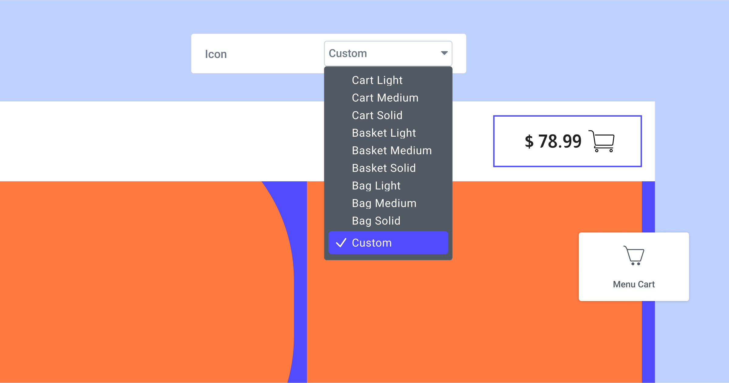
The Menu Cart widget includes three icons: the cart itself, the dismiss button to close the cart, and the “x” button to remove an item. Previously, for the cart itself you were able to choose one of 9 icons from the Menu Cart list, and you were unable to choose a different icon to dismiss the cart or remove an item. With this update, you will be able to choose or upload any SVG to use for each of the icons in the Menu Cart. To add a custom icon for the Menu, open the icon drop down list and choose Custom, this will display a new control to choose an icon from the icon library or upload your own SVG. For the Close Cart and Remove Item icons, the control to upload or choose an SVG is now available in the editing panel.
Align The Icons in the Icon List Widget
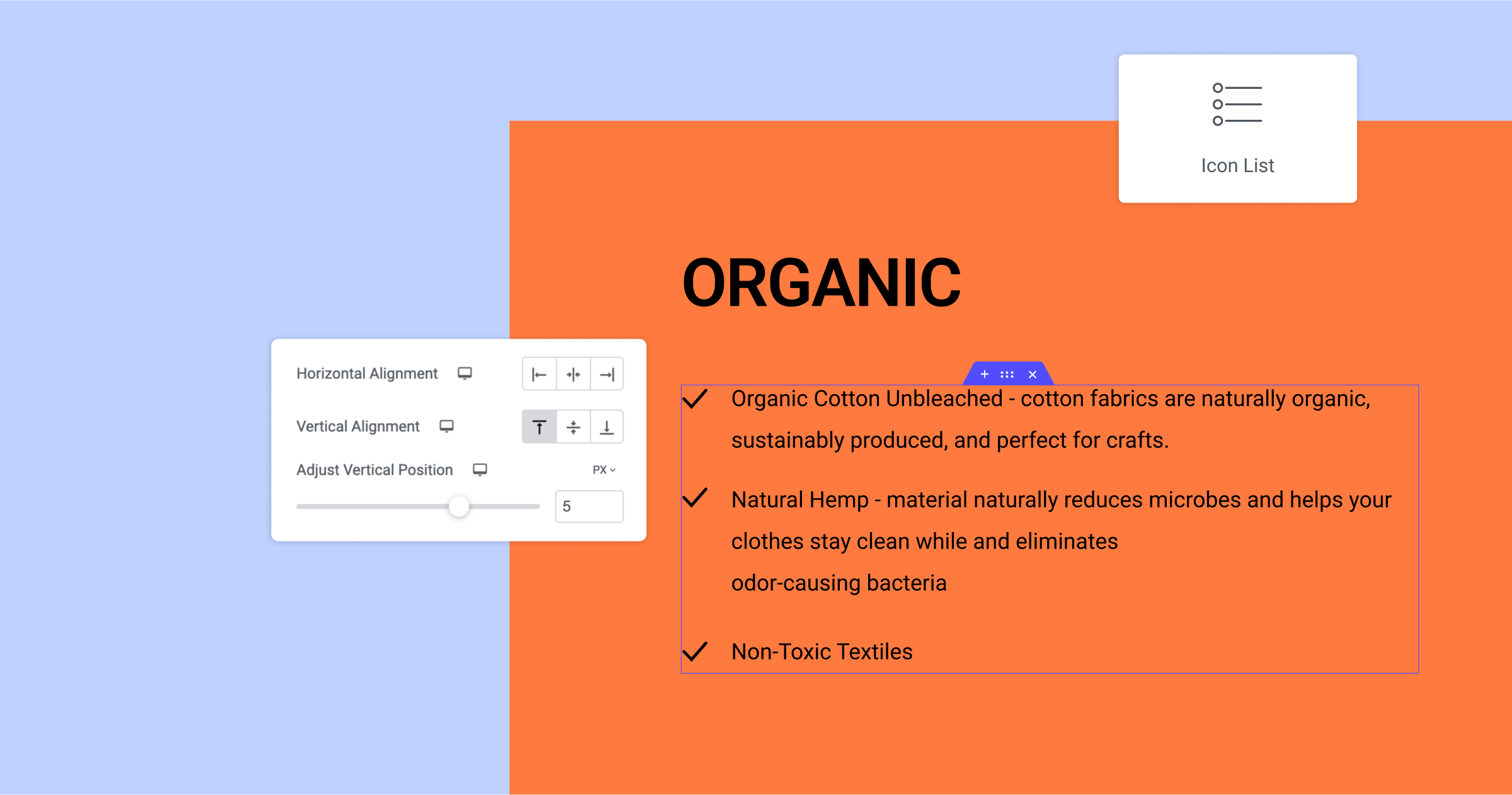
Up until now in the Icon List widget, if you had a list item that’s content exceeded one line, the icon would be aligned to the middle. Meaning, if your list item was three lines long, the icon would be aligned with the second line, in the middle. With this update, you will be able to choose what you want the icons to be aligned to – the top, middle, or bottom using the new Vertical Alignment control in the widget’s style tab. To achieve an even higher level of precision with your alignment, you can also use the Adjust Vertical Position control.
Choose any Unit Type, Anywhere
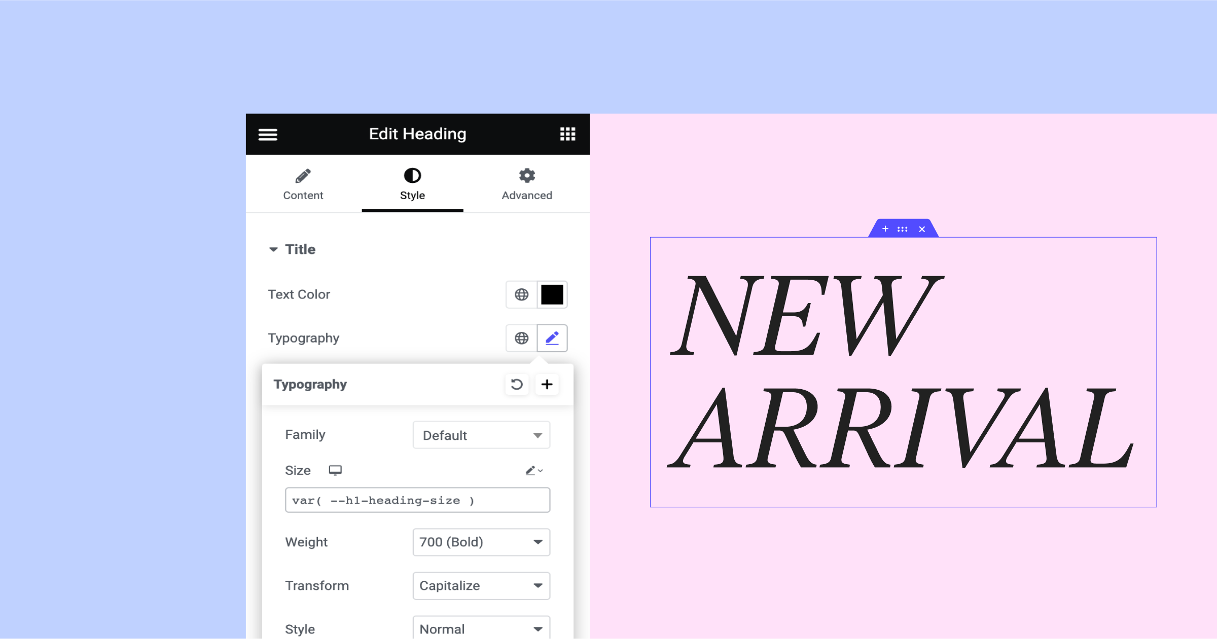
Elementor 3.10 first introduced the ability to add a custom unit in the containers, sections, columns, and typography controls. With this update, you will be able to use Custom Units in every unit-based field. This will also enable you to set custom CSS keywords and CSS functions for each unit-based field, which empowers you to achieve a pixel-perfect design. Along with this update, all unit-based fields have also been aligned, to include anything they may have been missing – EM, REM, pixels, percentages, VW, and VH.
With custom units, you can be more specific with your unit choices, and apply Custom CSS across your entire website or page. For example, you can run a CSS math function that will automatically adjust the typography font size based on variables you set in Custom CSS on the page or site settings. To achieve this outcome, you can use the CSS function: var( --h1-heading-size ) in your typography font size, and set the variables in the Custom CSS of the page or site: :root { --h1-heading-size: 3rem; }
Make An Impact: Share Feedback Before Features Are Released
We’re always looking to get to know Elementor customers on a deeper level. If you’re interested in meeting with our team and sharing your insights, feedback, and feature requests you’re welcome to sign up for some quality time with us here. Or download Elementor’s Dev Edition. Talk soon!
How to Install the Beta Version
If you still haven’t enabled beta testing in Elementor, please follow these steps:
- Go to Elementor > Tools > Versions
- Enable the beta tester feature
- Go to Dashboard > Updates and update to the latest beta version.
- This will get you set up to test the new Elementor 3.12 Beta.
Notes
As we make changes to our GitHub in an effort to keep it organized, improve the way we deliver information to you, and our ability to review your feedback, please follow the instructions below when reporting bugs, or making feature requests:
- To report a bug related to this beta version – open a new Bug report
- For feature requests – open a new Feature request issue
- For other comments specifically about this beta version – comment here
Designated time for release: March 27, 2023 (Estimated)
Many thanks for your support and help!
Cheers,
Elementor Team
