
Are you building a custom Elementor widget, and looking to add some Javascript functionality to it? You’ve come to the right place. Elementor has a best practice for adding Javascript handlers to custom widgets, which we are going to cover in this blog post. We will build a simple, Javascript-powered widget together, explaining every step of the process.
In addition to this blog post, our Developers site also has official documentation on adding JS to widgets.
Widget Concept
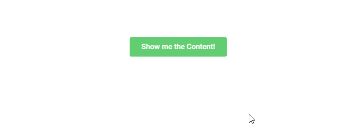
Our widget will consist of a button (similar to Elementor’s familiar button widget) and a content area (powered by a WYSIWYG text-editor). The content will load onto the page as hidden (display: none;). Clicking the button will make the button fade out and the content fades in to replace it.
We’ll call the widget “Content Toggle Button”.
Here’s a quick demo in my favorite format, GIF:
Let’s Start with the Widget’s PHP
We’ll start by composing a simple PHP class and supplying the basic information for our widget:
<?php

if ( ! defined( 'ABSPATH' ) ) {
   exit; // Exit if accessed directly.
}

/**
* Elementor Content Toggle Button widget.
*
* Elementor widget that displays a styled Button. Clicking the button replaces it with WYSIWYG content.
*/
class Widget_Content_Toggle_Button extends Elementor\Widget_Base {

   public function get_name() {
       return 'content-toggle-button';
   }

   public function get_title() {
       return __( 'Content Toggle Button', 'your-plugin-textdomain' );
   }

   public function get_icon() {
       return 'eicon-dual-button';
   }

   public function get_keywords() {
       return [ 'button', 'content', 'toggle' ];
   }

   protected function _register_controls() {}

   protected function render() {}
}
For more info about the structure of Widget PHP classes, see the documentation for creating a new widget.
Widget Controls
Within the _register_controls() method, we’ll add controls for the button text and the hidden widget content:
protected function _register_controls() {
	// WYSIWYG CONTENT
	$this->start_controls_section(
		'content_settings',
		[
			'label' => __( 'Content', 'your-plugin-textdomain' ),
		]
	);

	$this->add_control(
		'widget_content',
		[
			'label' => __( 'Content Box', 'your-plugin-textdomain' ),
			'type' => \Elementor\Controls_Manager::WYSIWYG,
			'default' => __( 'Widget Content', 'your-plugin-textdomain' ),
			'show_label' => false,
		]
	);

	$this->end_controls_section();

	/*
	 * BUTTON TEXT
	 */
	$this->start_controls_section(
		'button_settings',
		[
			'label' => __( 'Button Settings', 'your-plugin-textdomain' ),
		]
	);

	$this->add_control(
		'button_text',
		[
			'label' => __( 'Button Text', 'your-plugin-textdomain' ),
			'type' => \Elementor\Controls_Manager::TEXT,
			'default' => __( 'Button Text', 'your-plugin-textdomain' ),
		]
	);

	$this->add_responsive_control(
		'button_align',
		[
			'label' => __( 'Button Alignment', 'your-plugin-textdomain' ),
			'type' => \Elementor\Controls_Manager::CHOOSE,
			'options' => [
				'left'    => [
					'title' => __( 'Left', 'your-plugin-textdomain' ),
					'icon' => 'eicon-text-align-left',
				],
				'center' => [
					'title' => __( 'Center', 'your-plugin-textdomain' ),
					'icon' => 'eicon-text-align-center',
				],
				'right' => [
					'title' => __( 'Right', 'your-plugin-textdomain' ),
					'icon' => 'eicon-text-align-right',
				],
			],
			'default' => 'left',
			'selectors' => [
				'{{WRAPPER}} .elementor-content-toggle-button-wrapper' => 'text-align: {{VALUE}};'
			],
		]
	);

	$this->end_controls_section();
}
Feel free to add some styling controls. For more info on adding controls to widgets, see the documentation on adding controls to widgets.
Widget HTML
Within the render() method, we will output our widget’s HTML:
protected function render() {
	$settings = $this->get_settings_for_display();

	?>
	<div class="elementor-content-toggle-button-wrapper">
		<a class="elementor-content-toggle-button-btn" href=""><?php echo $settings['button_text']; ?></a>
		<div class="elementor-content-toggle-button-content-box"><?php echo $settings['widget_content']; ?></div>
	</div>
	<?php
}
Notice that the button is an <a> tag wrapper by a <div>, and the content box is just a simple <div>. We said simple, didn’t we?
Widget CSS
We’ll create a separate CSS file with some basic styling to make the button look like Elementor’s native button widget:

We’ll call the file content-toggle-button.css:
.elementor-content-toggle-button-wrapper {
    text-align: center;
}

.elementor-content-toggle-button-btn {
    border-radius: 3px;
    background-color: #61ce70;
    color: #ffffff;
    display: inline-block;
    font-family: "Roboto", Sans-serif;
    font-size: 15px;
    font-weight: 500;
    line-height: 1;
    padding: 12px 24px;
}

.elementor-content-toggle-button-content-box {
    display: none;
    text-align: initial;
}
We will take care of integrating the CSS into our plugin later on.
Finally, the Javascript
Ah, the moment we’ve all been waiting for. We’ll write a Javascript handler for our Widget, to give it that show/hide functionality we mentioned at the beginning of the post.
The Javascript handlers for Elementor’s native widgets are written as ES6 classes. The handlers all extend a base class which provides some useful functionality.
class ContentToggleButton extends elementorModules.frontend.handlers.Base {
   getDefaultSettings() {}

   getDefaultElements() {}

   bindEvents() {}
}
getDefaultSettings
This method is used to configure settings to be used by other methods of our handler class. The method should return a settings object. getDefaultSettings is most widely used to enter the jQuery selectors of the HTML elements in your widget you would like to target.
In our example, this method would look like this:
<pgetDefaultSettings() {
return {
selectors: {
button: '.elementor-content-toggle-button-btn',
content: '.elementor-content-toggle-button-content-box',
},
};
}getDefaultElements()
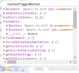
This method creates jQuery objects from the widget’s targeted HTML elements, and appends them to the class instance object under a property called elements. Grabbing the settings object is done by calling the base method this.getSettings(), passing in the key for the requested setting as a parameter.
The image on the right shows the handler class instance as it is running in Chrome devtools.
In our case, our method will look like this:
getDefaultElements() {
const selectors = this.getSettings( 'selectors' );
return {
$button: this.$element.find( selectors.button ),
$content: this.$element.find( selectors.content ),
};
}For convenience, we gave the property name for our jQuery objects keys with identical names to the ones in our settings object, only prefixed with a $ sign.
bindEvents()
This method is used to add event listeners for interactions with our widget’s HTML.
Since we want our button to fade away on click, and reveal our content box, we’ll add an ‘on click’ listener:
bindEvents() {
this.elements.$button.on( 'click', this.onButtonClick.bind( this ) );
}Notice our callback in this case is another method called onButtonClick. We are binding the method to this, to make sure it does not lose the widget’s context when it runs.
onButtonClick()
This custom method will be included in our handler class, and will handle everything that happens when a user clicks the button.
Our onButtonClick method will look like this:
onButtonClick( event ) {
event.preventDefault();
this.elements.$button.fadeOut().promise().done( () => {
this.elements.$content.fadeIn();
} );
}First, we prevent the default browser response when our button link is clicked. Then, we use jQuery’s fadeOut() method to make the button disappear on click. To make sure the content fades in only once the button has finished its fade-out animation, we chain a promise to the method. In the promise’s callback we call jQuery’s fadeIn() method on the content box.
For more information about these handler methods, see the official documentation on adding Javascript to custom Elementor widgets.
The complete handler class
The finished handler class looks like this:
class ContentToggleButton extends elementorModules.frontend.handlers.Base {
getDefaultSettings() {
   return {
       selectors: {
           button: '.elementor-content-toggle-button-btn',
           content: '.elementor-content-toggle-button-content-box',
       },
   };
}
getDefaultElements() {
    const selectors = this.getSettings( 'selectors' );
    return {
        $button: this.$element.find( selectors.button ),
        $content: this.$element.find( selectors.content ),
    };
}
bindEvents() {
    this.elements.$button.on( 'click', this.onButtonClick.bind( this ) );
}
onButtonClick( event ) {
    event.preventDefault();
    this.elements.$button.fadeOut().promise().done( () => {
        this.elements.$content.fadeIn();
    } );
}
}For wider browser support, it is recommended to transpile your class into ES5 syntax (using a tool like Babel.js) before deploying it in production.
Registering the Widget Handler with Elementor
Finally, we need to make sure the widget handler integrates properly with Elementor and is called at the right time.
This is done by listening to Elementor’s elementor/frontend/init event. In the listener’s callback, we attach our handler registration function (elementorFrontend.elementsHandler.addHandler) to a hook that runs only once our widget’s instance is rendered on the page/in our editor preview.
jQuery( window ).on( 'elementor/frontend/init', () => {
   const addHandler = ( $element ) => {
       elementorFrontend.elementsHandler.addHandler( ContentToggleButton, {
           $element,
       } );
   };

   elementorFrontend.hooks.addAction( 'frontend/element_ready/content-toggle-button.default', addHandler );
} );
For more information on registering widget handlers, see the documentation.
Enqueuing the handler script
To get our handler script to load when our custom widget is used, we have to go back to our widget’s PHP.
Since our widget’s class does not utilize a constructor method, we create one:
class Widget_Class_Name extends Widget_Base {

    public function __construct($data = [], $args = null) {
       parent::__construct($data, $args);

       wp_register_script( 'ctb-script', '/path/to/content-toggle-button.js', [ 'elementor-frontend' ], '1.0.0', true );
       wp_register_style( 'ctb-stylesheet', '/path/to/content-toggle-button.css' );
    }

    public function get_script_depends() {
      return [ 'ctb-script' ];
    }

    public function get_style_depends() {
      return [ 'ctb-stylesheet' ];
    }
}
We register our script using WordPress’ native wp_register_script function and we do the same for our stylesheet using WordPress’ native wp_register_style function inside our constructor.
To make sure our registered script and style are enqueued, we add two more methods to our Widget’s PHP class, the first is called get_script_depends() which returns an array with our script handle. The second is called get_style_depends() which returns an array with our style handle (see above). This makes sure our scripts and styles are enqueued at the right time and only when the widget is in use.
That’s it!* Enjoy creating your very own JavaScript-powered custom widgets!
* Once your widget class is ready and complete, make sure you do everything else required for an Elementor add-on plugin to work properly, such as registering the widget with Elementor’s widgets_manager. For more info, check out the documentation on extending Elementor.